Pages

Tuesday, 31 August 2010

Restoring Casalino chairs

Over the past month, my roving eye has been searching for two vintage Casalino chairs to use on our deck.


Casalino chairs were designed in 1971 by Alexander Begge for Casala and are made from moulded plastic. It was the outdoor chair to have in the 70s. And for me, it is the outdoor chair to have in the 2010s.

They have a great cantilever shape, are stackable up to four chairs and weatherproof.

As part of my search, I've been harassing Katherine from theoldboathouse and doing random drive-bys in suburbs with hard rubbish collections. Look, I even dabbled with....(Gasp! Was that thunder I just heard?)...buying replicas!!

Before: these Casala chairs are a pale blue and green

Well, the search is over. I bought two vintage Casala chairs on ebay (which was very silly, since I paid too much for them). But then there were another five for sale in Saturday's paper. I bought those too (because they were a good price). So now I have seven chairs.

Not sure what came over me - I must have Casala fever!

I'm now restoring them. Apparently the done thing is to take them to a panel beater and have them re-sprayed with 2 pack paint. It makes them glossy and more durable; even better than brand new.

The chairs are in reasonable condition, so I felt I didn't have to do this step. The chairs were just extremely scuffed and grimy, but they hadn't achieved that super-chalky texture which occurs on these chairs.

Check out the filth!
The first step was to give them a thorough wash with warm soapy water (I used dish washing detergent and a green scourer). With a bit of elbow grease, this lifted off most of the marks. For the really ingrained dirt, I used a spray on mold remover, left if for a few minutes and rinsed it off. Make sure to wear gloves and long sleeves to avoid fibre-glass itch when you're scrubbing.

With the power of Google, I discovered that a cut and polish suitable for fibre-glass would help restore and protect the finish. We used Autosol but there are a couple of other products which do the same thing. Just rub  it on and polish off.
Image from here
The stubborn marks came off easily and with a clean towel I was able to buff the chairs, creating a nice low sheen.

The chairs don't look like they are over 30 years old and equally important, they don't look brand spanking new.

So far, I'm really happy with the result. They've certainly come up a treat, but I'll keep you posted about how the finish lasts.

After: the finished pale green and blue Casala chairs. They look fantastic now!

Two of the five white Casala chairs. These have been cleaned but not yet cut and polished.

Monday, 30 August 2010

Shout out

This is a shout out and thank you to Shiloe from Tar Paper Crane who has kindly mentioned Fun and VJs on her blog. We're featured on Tar Paper Stars. Yay!


Shiloe is a project manager for a construction company in Oakland, California and she also writes a blog about renovating older homes.  I was avidly following the progress of an English Tudor style home and a Little Blue Cottage, which Shiloe was managing.

Amazing transformations and very interesting for those living through renovation work. Check out Shiloe's site here.

Thanks again Shiloe!!

Sunday, 29 August 2010

Planting Lilly Pillies

Bright and early on Saturday morning (6am), I went to the Rocklea Saturday Fresh Markets. My mission was to pick up lilly pilly plants for our side yard to make a hedge and to pick up a bag of croissants for breakfast.

Mission successfully completed!

I bought 15 Syzygium Aussie Southern lilly pilly plants which are a glossy leaf native. They grow to about three to four metres high and produce fluffy flowers which attract nectar eating birds. They also produce little berries which are apparently edible for those who have 'bush tucker' tendencies.

We already had lilly pillies growing on our back fence line when we moved here last year, so we thought it best to stick with the native theme. They are quite attractive too.

Young Aussie Southern Lilly pilly plants

Jason and sons working hard

Lilly pilly hedge...one day...

We have to make sure that they get a good drink everyday while they are establishing in their new home. Thankfully, we have a full rainwater tank to assist with this task. 

I applied a soil wetting agent to the soil because I had a bottle of the stuff lying around in the shed. This week, I'll be laying down sugar cane mulch to stop the weeds and improve water retention in the soil. 

I'm very conscious of their need for water in our drought-prone climate. Grow my little pretties, grow! Cross your fingers and toes that they do well for us.

Thursday, 26 August 2010

Home advice for Bob

Australian politics is in limbo after last weekend's election. The fate of the nation rests on the decision of four independents and a Green and whether they will support either a Labor or Coalition minority government.

It has been said a thousand times before, but let me repeat it here, there have never been more interesting times in federal politics!

Dear old Bob Katter, the federal member for the Queensland seat of Kennedy, Australia's third largest electorate, is one of those independents. This seat represents most of rural Queensland in the north.

Bob is a potential king or queen maker and any other adjective, depending on your personal assessment of him. A very subjective description, I would add.

Anyway, what kind of home does Bob live in? I saw a photograph of Bob's Charters Towers home in Tuesday's Courier Mail and I was utterly fascinated with his decorating style.

Bob Katter at home image from here 
It is by no means a grand home as the walls and ceilings are fibro, but it is still very elegant at first glance.

Look at the lovely silvery grey formal sofa. It has a superior shape and the colour is so now. I would probably suggest some Orla Kiely cushions with a hint of pink and blue. A bright pop of colour against a neutral palette. They'll look stunning.

(Bob, if you're reading this, you should not throw your legs over the arms like that, if you want the chair to remain in tip top condition.)

Bob also has an eye for classic Queen Anne style furniture. Very tasteful. And I'm glad he was not tempted to spray paint them white, as is so fashionable now. The timber seems to be very good quality.

I would mix up the items in the crystal cabinet. Mid-century modern glassware from Iittala would look fabulous with the silverware in this traditional cabinet. My advice is that less is more - a few accent pieces only.

Portraits of one's political heroes (Red Ted), in the home, seem a bit stuffy. Bob, again if you're reading this, you  need to email me and I'll send you the name of a few indigenous artists. Their modern aboriginal paintings are highly sought after. It will totally transform the tone of this space and you'll be seen to support a chunk of your electorate too. Win, Win.

The chandy above the dining table gets the big thumbs up. Perfect, Bob. I do need to warn you though, my thrifty shabby chic readers will be harassing you about where you found that delicious piece of bling!

There are two words you need to absorb. Feature wall. That back wall is screaming for colour. A four litre tin of dulux warm grey. You won't regret it.

Sadly Bob, it appears your wife, Susie, lost the argument about how to display your weapons...

Yes, yes, I know you must decorate and surround yourself with the things you love. That's what the decor lifestyle blogs have us believe...However, I suggest you rethink this particular look - a different paradigm is needed. The bayonets and Enfield rifles should really go in your study. Preferably, in a locked cabinet.

Your next lot of dinner guests, Tony and Julia, will thank me for this advice.

p.s Bob, I could do with a few more followers. Julia let me down after all my good advice a few months ago. The subscribe button is on the right. xx

Tuesday, 24 August 2010

Designer wastepaper bin

We have unattractive wastepaper bins - cheap and nasty looking. Our lives would be better if we upgraded.

Our rubbish deserves better.

And here are two bins which tickled my fancy:

image from here

The above image is the Bin Bin made by Essey and manufactured in Germany. Designed by John Brauer, this bin is meant to look like its contents, crushed paper. It retails from about $40 to $70 in Australia. Snazzy!
Image from here

The above bin just delighted me. It is from the Classique Collection line which won an Australian International Design Award in 2003 (it's even in the Powerhouse Museum Collection). 

The bin is designed by Design+Industry Pty Ltd and manufactured by Snaith Industries - Australian made and designed. It was made to successfully compete in the mass consumer market against cheap imported household products. The collection also produces a storage container, laundry hamper and laundry basket. You can read all about the virtues of these products here.

The wastepaper bin costs around $10 or less and is available at Target, BigW and Woolworths. You may well own a designer bin and not even know about it.  

That's truly good design within reach.

Sunday, 22 August 2010

Herbs in a concrete laundry tub


Herbs in a concrete laundry tub planter

I received lots of good advice regarding what to do with our three section concrete laundry tub. I followed the herb path, because it seemed to be the most practical option, since I cook with herbs regularly.

Some readers said to drill drainage holes in the tub, but there was already a drain hole in each separate section. I'm crossing my fingers that this will be sufficient. There was an old tree root blocking the holes, so that was removed with much pulling and tugging.

I then placed a wooden block under each end of the tub to keep it off the ground and to make sure it drained well. And it did when I filled the tub with water. But then I had to have a Nana nap because that tub is incredibly heavy to lift.

One commenter suggested I fill the tub part way with broken pieces of styrofoam, followed by a thick layer of wet newspaper and then my potting mix. (Thanks Shelly!) This should help with drainage too.

A few readers said I shouldn't bother painting the tub. I followed this advice gladly -  it appeals to my lazy side!

This morning I bought a selection of herbs from the Rocklea Markets: basil, coriander, mint, chilli, sage and parsley. The whole lot cost a paltry $5 and will be enough to get me started.

While at the markets, I scouted around for some screening plants for our side yard. I'm advised from reliable thrifty sources that this is the place to go for affordable established screening plants. And they were correct.

Anyhow, the new herbs have been planted, watered and now we wait to see if the recipe is good enough for them to grow.

Friday, 20 August 2010

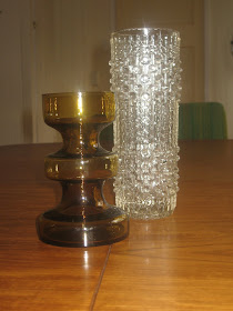
Sklo Union vase

I really like art glass, so I have added two new pieces to my small retro collection. They were both very inexpensive purchases.

L to R: 1960s hooped glass vase (maker unknown) and candle wax vase by Frantisek Pecency for Hermanova Hut.

I liked the toffee colour and shape of the hooped vase - it has a Scandinavian feel even if it's pretending.

The clear vase is my first foray into the mass-produced world of mid-century Czech art glass. Wow! It's all about texture with Sklo Union, which is my latest obsession...!


Here is the newly adjusted art glass collection on the plate shelf in our kitchen. I know, it's a very random assortment, but it is also a great burst of colour for our white walls.

Wednesday, 18 August 2010

Green Bin hope

Our efforts in the yard last weekend produced yet another enormous pile of green waste. This happens frequently when Jason works in the garden. He specialises in remorseless plant removal.

remnants of a wild Duranta Geisha Girl (she was more Sumo than Geisha in her size) and general tree prunings.

I hate these green piles. They are a haven for snakes and we don't have any screens and, if you don't already know, I dislike reptilian company.

You won't see me in Australia Zoo chanting, "Crikey! Crocs rule."

Imagine my delight when this sight appeared on our footpath this afternoon.

Notice the sparkle around the Green Bin lid. It's a sign.

The much anticipated Green Bin - fortnightly green waste removal courtesy (at an extra cost) from the Brisbane City Council.

I'm in green waste heaven.

It may take a couple of weeks to get rid of the pile, but that's okay. The plan is to garden more regularly, rather than this binge gardening habit we've developed.


You're never too young to learn how to bring in the bins

Monday, 16 August 2010

Matador fabric


Sunroom

Groovy Matador fabric

I stuffed another cushion.

This was a cushion donated to the Sow's Ear from funky Jo at Desire to Inspire. She's got great taste in thrifted fabric.

Anyone who grew up in Australia (and elsewhere, I suppose) in the 1960s or 70s would remember this fabric. Jason certainly did, because his uncle and aunt used to have a wall hanging of the same image.

The old Matador wall hanging was sewn into an extra large cushion by Jo's darling husband Kelvin. It is sitting on the old Featherston Numero IV modular ottoman for now.  The cushion is extremely well made and a fun piece for our reading nook!

I also have to add that Kelvin is blind and was the person responsible for making our Florence Broadhurst cushions.

Amazing, isn't he?

Saturday, 14 August 2010

Concrete laundry tub


This morning we cleared out the overgrown garden bed on one side of our property. It was neglected when we bought the Sow's Ear last year and we just neglected it further...


Cleared garden bed

After a good morning's work, it is looking less neglected, but we also have a better view of Boo's decrepit house and the not-so-lovely green corrugated iron fence.

The plan is to plant a bushy hedge which grows super-fast. Perhaps a row of native Lillypillies or even Sweet Viburnum or Photinia Robusta.

Lillypilly image from here

Sweet Viburnum

Photinia Robusta

Anyway, in the bed was this three section concrete laundry tub. It must have been the original one used when the house was built. Since decommissioning, the tub had been used as a planter box...but there was nothing worthwhile growing in it.


There is only one word to describe the tub. Heavy. With a capital H.

It took every ounce of strength, from both Jason and I, to just roll it out of the garden bed. Using what was left of our strength, we pushed it a few (maybe five) centimetres back against the garden edging.

Jason wanted to move it 10 metres so that it could sit on the driveway. There was no way that was happening. That thing weighed a tonne!

As punishment for its excessive weight, Jason scurried to the shed to find the sledge hammer to smash the tub to smithereens.  (That man has such a destructive streak!)

"Noooo! You can't break it up," the hoarder, in me, pleaded. " I'm going to do something with it. Don't break it, please."

Now that I have saved it from Jason's sledge hammer, I have to do something with it. Pronto.

What do you think I should do? I'm thinking a spray paint and perhaps herbs? It is also going to stay in the same spot because it is seriously, too heavy to move.

Thursday, 12 August 2010

Gratuitous cushion photo

Living room with Florence Broadhurst's circles and squares cushions

The new Florence Broadhurst cushions in the lounge room are winners. It makes our living area so much cosier, but with a punch of elegance.

We are enjoying plumping and adjusting these beauties.

Thanks again to Jo from Desire to Inspire for her generosity, which you can read about here.

Monday, 9 August 2010

1928 Queenslander house

Mr Rooney, a respected builder, paid us a visit yesterday. We are planning on sprucing up the exterior of the house. You know, repair and replace stairs, add window hoods, remove wood rot and replace windows. All in preparation for exterior house painting.


Anyhow, it was a very interesting conversation and if all goes to plan we will have a schmick looking house before too long.


Mr Rooney's visit also reminded me that I had always meant to go to Brisbane City Council's Archives to find out when the house was built. It's my feeble attempt to ensure that whatever external changes we make are not too out of kilter with the original era of the house.


To Council Archives, I went; with an historical property title in hand.


My title search, which was done earlier this year, told me the land was purchased in November 1927, but there are no details about when a dwelling may have been built.


Council archives has the original Register of New Building records which gives you an approximate date of a building approval.  For the Sow's Ear, February 1928 is the date recorded in the book, so one can assume the house was built over the following 12 months.


The records also told me that one of the original owners, Stanley Stables (he owned it with sisters Zoila and Florence), worked for Queensland Main Roads Department; the builder was T.D Griffiths in Adelaide Street, Brisbane; and that the house cost 550 pounds to build.


I was able to view, on microfiche, Council plans from 1956 which included an outline of the existing house on the property. 


It told me that in 1956, the house was not yet sewered as the outhouse was in the backyard and that there were no back steps (The back deck may have been added after Stanley's death in 1988 by the next owners). There was also a water tank in use in the 50s.


Some of the modifications made to the house, such as the bay window in our bedroom and the verandah being enclosed, predate 1956. 


Hmmm... it's all Stanley's fault for doing some of the "improvements". And it all forms the wonderful history of the house.


The staff at Brisbane City Archives could not have been any friendlier or helpful. If you are located in Brisbane and felt inclined to do any sort of house research, I would highly recommend you give them a phone call to see if they can assist.

Sunday, 8 August 2010

Not Arne Jacobsen Vola Knobs

Jason sent me on a mission to seek and purchase suitable knobs for Number 1 son's wardrobe doors.

I hadn't even considered door knobs at all...Didn't he realise, I must do hours of endless research before deciding on the appropriate ones?!

So off I went, completely clueless (more so than usual). The first place I thought to look was Bunnings. There were wooden knobs, round knobs, square knobs, brass knobs and even teddy bear knobs.


And, amongst it all, there was this knob. Modern, simple, made in Taiwan. I bought four.

Last night, I started my retrospective door knob research (sad, eh?) and stumbled upon Remodelista's top ten modern cabinet knobs list. Very handy!

Vola door knob designed by architect Arne Jacobsen. Image from here

Arne Jacobsen Vola door knobs, designed in the 1960s, made their list. It is made by Vola A/S which is a Danish company that make the iconic Arne Jacobsen Vola tap.

Vola tap image from apartment therapy

Anyhow, my Bunning's version is not too dissimilar...except perhaps for the made in Taiwan business and, of course, the price. Ha! (Sorry, the Vola knobs, at US$50 a pop, are not meant for cheap pine louvre doors.)

It seems as if Arne Jacobsen's design is not alone, as there are other versions of what is essentially the same knob.


This image is of a Hafele knob

This bedazzling Swarovski crystal door knob image came from  here

Interesting.

The knobs I bought are probably not meant for bedroom cupboard doors, but I don't care. They look good on what are fairly ordinary looking louvre doors.

We were planning to replace these cupboard doors but as they were still in good condition a coat of white paint was enough to give them new life.

At least the knobs for the doors are discrete, which I think is a good thing for cupboards.

New door knobs on louvre cupboard doors


Freshly painted cupboard doors

Before of the old cupboard doors with their timber knobs

Friday, 6 August 2010

Florence Broadhurst cushions - circles and squares & horses stampede


Remember how I was talking about buying some Florence Broadhurst fabric to make some cushions...Well a Lurker on this blog emailed me to say she had some Florence fabric lying around that would be perfect for me. 

What the?

(If I had only known my blog was a path for obtaining my heart's desire, I would've put it out there that I was in the market for a 1960s Hayes & Scott designed home, which came with a nanny, a cleaner and eye-candy pool boy! Greedy thing that I am!)

And I wanted to be gracious and say I couldn't possibly accept, but I just couldn't. Naturally, I said YEAH! 

The Lurker, who is also a very well-known blogger, said she had picked up the fabric cheaply a number of years ago and that she wasn't going to get around to doing anything with it. She wanted it to go to someone who would use it and appreciate it. 

That is pure kindness, isn't it? (It is also not the first time readers have emailed me to offer me things which I have admired. I have THE loveliest readers. You know who you are). 

Check out the stash of Florence Broadhurst covers!

Gorgeous circle and squares and horses stampede Florence Broadhurst fabric
Lovely cushion covers already made! (There's a story in that, which I will leave for another time). 

There are six circle and squares cushion covers and two horses stampede covers. I just have to buy some inserts and finish off the edges. 

I am completely overwhelmed by this Lurker's kindness. Such a generous, generous gesture.

Today, she came over for morning tea which we had out on the back deck. The lovely Katherine from theoldboathouse came along too (she was very naughty and brought a retro gift, which I adore). We had a fabulous conversation about all things furniture and houses. Great fun!

So, who was this well-known lurking cushion philanthropist blogger??

The very cool Midcentury Jo from Desire to Inspire!! 

Ha! Who knew she read me?

Thanks again! xx


Thursday, 5 August 2010

Mexican shopping

My friend Melissa took me to a Mexican handcraft wholesaler's warehouse in the deep south of Brisbane. Actually it's not that deep, it's just in Coopers Plains.

She discovered the shop via her brother, who is a collector of Day of the Dead objects, and now she too is a big fan.

This place is open to the public for lucky Mexican loving Brisbane folk. When you enter the display room, it is as if a visual bomb went off. So overwhelming en masse.

The shop was full to the brim with amazing handwoven textiles, colourful hand-painted pottery, Day of the Dead folk art, milagros and alpaca jewellery.

Colour and pattern ruled, so it is a great shop in which to browse. And it's cool to discover different places off the beaten track.

I also know that my next wool rug purchase will be Mexican. They were excellent quality and not too outrageously priced. Yet another thing to research and obsess about!

Hand painted pottery owl on the kitchen shelf

This cute little pottery owl took Son # 3's fancy because he was hooting at it. As a reward for mimicking the correct animal sound, I bought it for him. It's safely in the kitchen for now until he can be trusted not to make it fly off the back deck!

Tuesday, 3 August 2010

Not so nostalgic visit

The very first home that Jason and I bought together is back on the market. We lived there from 1998 to 2002. It was a two bedroom 1950s post war house  - a former housing commission home.

A very neat and tidy starter home for a young couple in the suburbs.


this image has a very similar floor plan and exterior to our first home

We thought it would be fun to go to the open house inspection. You know, show the kids and remember fondly our first foray into home ownership.

Bad idea.

The house had been rented out. And clearly the tenants were not house-proud and nor was the landlord, it would seem.  The fly screen doors were shredded, the polished floors were trashed, there were holes in cupboard doors, the kitchen lino was torn, the decks had been neglected. Ghettolicious.

Not one bit of maintenance. No one gave a flying f*ck in eight years. It is really sad.

I had brought my camera, but I didn't have the heart to take photographs. The old house didn't deserve to be humiliated any further.

It used to be a nice home and could be again with the right person. I hope someone will buy it and give it some love.

Sunday, 1 August 2010

Exterior house colours and one year blogiversary


While reading the Saturday Courier-Mail, I spotted this house in the Space section of the Qweekend. It was a brief article regarding the renovation of a 1930s cottage in Toowong, completed by Queensland architectural firm Arkhefield. You can check out the project brief here if you are hard core (like me).

I am sharing this image with you purely because of the exterior colour scheme. This is what we have decided for our house. White with minimal dark, almost black trim. (The trim looks like 70 per cent Lindt chocolate brown if you think food analogy). I haven't seen many pure white painted Queenslanders with dark trim (but I don't get out to the more salubrious suburbs), so I was very pleased to see this photo.

I think our house would look great like this. Nothing like a photo to get one inspired! As I've said before,we need to lose the heritage colours and the rendered Tuscan apricot look we currently have. I believe Tuscan apricot and heritage are words which should never to be uttered together.

Also, you must congratulate me on Fun and VJs' first year anniversary - a blogiversary! One year of consistent blogging about all things house related.

I've been very fortunate to have such a lovely community of readers/lurkers and a great band of gracious commenters who are a lot of fun! The gold comments I receive are priceless. Thank-you everyone!