Monday, 29 April 2013

Archived

I just thought I'd share some cool news with you. I was contacted by the State Library of Queensland who were seeking permission to archive Fun and VJs... Yeah!

It means that this blog, among many thousands, will be preserved for future generations. The State Library is committed to preserving the documentary heritage of the state which extends to contemporary electronic resources, including online publications and websites of lasting significance.

image from State Library of Queensland website

In other words, we rock. Actually no, we don't but it's still nice to be considered significant even in some small way.

Our ancestors will be able to research Jason's strange shirtlessness fetish in 2009 and 2010, how his French car of choice was a lemon and how he discovered hi-vis work wear in 2012.

And hopefully while they're reading the archives they will learn more about an interesting 1928 Queenslander house and its owner's renovating endeavours to make it a home. 

Thursday, 25 April 2013

Anzac cake on Anzac Day

Today we remember the fallen. You can't help but feel moved when the Last Post is played. For me it is a reminder of the sacrifice made by all those who have served during times of conflict...and not just 'our' side.

This morning Jason took the older boys to our local service as is our tradition every year. One son marches in Scouts, while the other marches with his school.

After the service, some of our good friends gathered at the Sow's Ear for morning tea. It's a nice easy day to catch up with friends we do not see often enough.

I decided to try out an untested recipe called the Modern Anzac Cake from Tamara Milstein's Bake your cake and eat it too.

Modern Anzac Cake
I used by new Florence Broadhurst cake plates too


It's based loosely around the Anzac biscuits which were sent to the soldiers during WWI. It consists of a rather moist cake batter which is then topped with an Anzac biscuit-like topping. The contrast between the different textures made it a little bit more interesting than the standard Anzac biscuit.

Here is the Anzac Cake recipe for those who are interested in baking:

Ingredients:
Cake:
125 g butter, softened
200g sugar
2 eggs
1 tsp vanilla essence
85g ground almonds
3 tablespoons cocoa
30g shredded coconut
200g self raising flour
320g sour cream
125ml strong black coffee

topping:
150ml water
1 cup sugar
4 tablespoons golden syrup
80g butter
150g flaked almonds (I didn't have any and just put in extra coconut and oats)
30g shredded coconut
30g rolled oats

Method:

Preheat the oven to 180°C and grease and line a 24cm cake tin (I just lined the bottom and sides with baking paper).
Cream the butter and sugar together until thick and pale, then add the eggs one at a time, beating well after each addition. Add the vanilla and mix well to combine.
In a separate bowl, combine almonds, cocoa, coconut and flour.
Fold half the flour mixture into the batter with the sour cream and combine gently. Add the remaining flour mixture with the coffee and mix well.
Bake for one hour until puffed and cooked through.
Meanwhile, place the water and sugar in a small saucepan and heat gently while stirring to dissolve sugar. When the mixture begins to boil, simmer for 5 minutes, brushing sides of the pan with a pastry brush to ensure sugar granules do not stick.
When the mixture is pale gold, remove from the heat and stir in the golden syrup, butter, almonds, coconut and rolled oats. Stir thoroughly, returning to the heat if necessary to help you mix the ingredients well.
After the cake has cooked for one hour, remove from the oven and pour mixture over the cake, then return to the oven for 10 minutes or until the topping has set.
Remove the cake from the oven and cool in the tin for 10 minutes. Use a knife to loosen any toffee from the sides of the tin, then remove the cake and cool completely on a wire rack. (we ate it warm  but it is nicer cold)
Anzac cake
It is very sweet but marries nicely with a good cup of coffee. 

Wednesday, 24 April 2013

Mother’s Day peace and Magshop


Sponsored by Magshop

Every year the boys buy me gifts from the Mother’s Day stall at their school. Jason gives them some cash (the richer boys use their pocket money) and they each choose a small gift. It amuses me to see what they have personally selected.

Son #1, without fail, buys me something hygiene or grooming related. Think soap, face washers, emery boards…you get the picture. I’m not sure if he’s giving me subtle hints to lift my game. If he gets me deodorant, I’m going to really worry.

I suspect Son #2 buys me what he would like to receive as it always involves chocolates or sweets. He’s a bit of a gourmand and he knows I will share my chocolates with him. Luckily, the apple doesn’t fall too far from the tree, as I love sweets.

Son #3 is still untested. This will be his first year that he chooses something and I’m just dying to know what he will buy me. That is truly the magic of Mother’s Day for me, especially while the boys are still young.

The one Mother’s Day gift I always ask for is “Peace and no fighting.” I’m hoping this year will be the year they can deliver!

Belle and a very retro Wood & Sons trio in Cordoba pattern

And if it happens this year, an interiors magazine subscription from Magshop (hint to Jason) will be the perfect partner for the occasion (plus endless cups of tea and coffee as I put my feet up)!

I had a quick look at the magazines on offer at Magshop online and was excited at how varied the interiors titles were. Not only are there the standards like Australian House & Garden and Belle, but you can also subscribe to smaller titles such as Queensland Homes or purchase overseas mags like Elle Décor USA. What a great Mother’s Day gift for a house and garden junkie!

Magshop Mother's Day promotion
At the moment Magshop have a promotion running until 28 May 2013 where new subscribers will be automatically entered into a competition to win one of four trips to The Golden Door Health Retreat. Only the titles listed at Magshop Mother’s Day will be entered into the draw. Check out the details HERE. I’d probably choose Belle (hint to Jason).

EDIT: Now you can create your own online Mother's Day e-card which can be shared through email or your social media network. Click here to see how it works. 

So, what do you or your kids buy for Mother’s Day?  Is peace and quiet on the top of your wish list as well?

Monday, 22 April 2013

Nice new knob

Never underestimate the power a new door knob can make to the look of a room.

Jason picked up the 'antique' copper door knob that he had ordered the previous week and put it on the bathroom door on the weekend.

It was a bit hit and miss trying to find a salvaged one...and we wanted to see what the new ones were like...

'Antique 'copper bungalow door handle

It was just the door knob and plate Jason had to replace, so it was quite straightforward. The new hardware was relatively expensive, so we are pretty happy that we only had to replace the one.

To do an entire house would cost a motza! Fortunately at the Sow's Ear most of original door hardware is in good working order. Sigh of relief!

It's amazing how much nicer it looks - like it was always meant to be there. We are all about keeping the heritage Queenslander style so that it matches the other doors in this part of the house. It's all in the details as they say.

Jason in action fixing the door plate onto the bathroom door
Nice work Jason!


Friday, 19 April 2013

Billy cart's maiden voyage

Well, the billy cart (aka the Nazgul) we made was a huge success. We found the perfect grassy slope to test it out on and the kids had the best fun without any horrendous injuries. Win, win!

C'mon Dad, when can I have my turn?
You can't really tell in the photos but the slope in this park is quite steep. Fortunately, the ground was nice and soft after some rain, which slowed the billy cart right down and cushioned all the falls we* had.

Little Schumachers in the making...maybe not given the slow speed of the cart!
Somehow, I think it was the biggest kid out of them all who had the most fun...

Jason tackling the widow-maker slope. He did actually crash and burn on the way down

*I sensibly didn't have a turn because my poor old back is still not 100 per cent...I really couldn't face my doctor or my physio if the worst had happened...

"Ummm...yeah Doctor Tim, I came off my billy cart while racing down a steep hill..."

Not cool.

Thursday, 18 April 2013

Light news

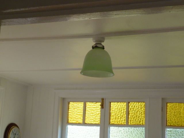
For the past couple of years we've had a light bulb as our light fitting in the study...Sad how that happens.

The bayonet fitting was actually broken and we finally had that attended to on the weekend.

study while it was being renovated last year
Because the ceiling in this room is quite low we are limited in what we can have as a light fitting.

Rather than buy a new one, we just re-used an old Art Deco glass shade that used to be in the bathroom. It's a bit paint splattered, but it's just going to have to do for now until we are motivated to strip it back.


And in more exciting news, I found some new Murano crystals to replace the broken ones in the great chandelier fall of 2011. I've been told by some readers, they remember exactly where they were and what they were doing when they first found out about our chandelier fall...it was big news.

pink Murano dragon tears

There are about 70 'new' dragon's tears which were part of another chandelier I had picked up.

I'm debating whether to keep the chandelier for the master bedroom though...or just use the tears in our dining room chandelier, as well as replace the drops in our new bathroom light fitting...

Decisions, decisions. (and be kind Anon Natalie! xx)

Anyway, we are just dripping in Murano crystal tears at the moment.

Monday, 15 April 2013

Architraves in the bathroom

Jason can't leave well enough alone. And just when we thought the bathroom was done...

On the weekend our new and improved bathroom received some extra architectural bling in the form of decorative window and door architraves (they match the rest of the Sow's Ear). The other bathroom windows had been done a few weeks ago, but we left the main window and the door alone...We weren't too sure how to attach the new mouldings without damaging the tiles.

As it turns out it was much simpler than we thought...just attach them over the existing plain architraves. Perhaps it's a bit unorthodox but it seems to work. After a bit of filler and paint, you would think those architraves were always there.

It must've been bothering Jason to have mis-matched architraves in the bathroom, as he was quick off the mark to buy the timber on Saturday. While he was out he also picked himself up a pair of new King Gees. OMG! He has it in his head that he has to look the 'tradie' part when he does a job around the house. He's gone mad.

Anyway, here are the fruits of Jason's labour on Saturday morning.

new architraves, bullnose and scotia around the casement windows 


We have the splayed  profile as the door architraves

I hope you aren't tiring of all these bathroom posts...we never seem to ever be completely finished at the Sow's Ear!!

Friday, 12 April 2013

New wheels

While the kids have been on school holidays we made a billy cart with left over timber from our renos and a few bits and pieces purchased at our local (hardware, not pub).

The boys just love it.

We've yet to give it a proper test-run because our street is too hilly and I can't face the prospect of broken bones at the moment. The billy cart doesn't have brakes. We plan to take it out this weekend though...on a nice gentle slope to start off with...

Check out our new wheels:

Billy Cart DIY
The kids have  dubbed it the Nazgul from Lord of the Rings...
Ha! We suspect our boys won't be making the rugby team anytime soon. 

Look at those beautiful lines
The seat folds down for easier transport
The boys are planning on making a few slight modifications and  add number plates 

The Nazgul is parked in Jason's carport because his mid-life crisis sports car (read the back story here) is at the shop getting repaired. It had an unfortunate incident with a car park post (and it was not my doing for a change). Yes, he's still held on to that French car despite all the hiccups with it.

I wanted to get a shot of Jason in his suit and new brogue shoes riding the billy cart as a fun shot for the blog, but he wouldn't be in it.

For someone who parades around shirtless rather shamelessly on this blog, he's become rather shy!

Wednesday, 10 April 2013

Solair Chair: Canadian design

I visited my mates Chris and Susan one evening and noticed two new groovy orange chairs on their back patio.

The patio doors were shut and it was dark, but from my perspective they looked like those string Acapulco chairs which are simply everywhere at the moment.

But no, I was mistaken.

Solair Chair in the Brisbane suburbs
They are chairs that I've never really noticed before -  the Solair 'Motel' Chair which is a Canadian design from the 1970s. They are of a plastic construction and as one of our friends put so bluntly: "It looks like the washing basket!"

Image from here.
The candy pink one looks fun
And it kind of does...but in a cool way.

You can find a whole lot of information about the chair from this site The Canadian Design Resource. The designers were Fabio Fabiano and Michelange Panzini and the chairs form part of the new wave of injection moulded plastic technology, which revolutionised chair manufacturing in the 60s and 70s.

Chris and Susan are revamping their pool area which currently has vibrant blue outdoor carpet. They're replacing it with darker blue carpet and the orange Solair chairs are part of their overall vision for that space.

It's going to look so good.

Blue outdoor carpet near the pool at Chris and Susan's last summer.
That's shirtless Jason there for your viewing pleasure
Apparently you can now buy the chairs in Australia from a stockist in Melbourne.  

Tuesday, 9 April 2013

Bathroom: before and after

We are happy with how our bathroom looks now. If we had imagined that painting the wall tiles would've looked this good we would've done it at the very start of our sojourn at the Sow's Ear. 

Although we are not really advocates of temporary renovations, sometimes it's just necessary... particularly if you are 'umming and ahhing' about whether you intend to stay in a home forever or planning larger long-term renovations where rooms may need to be changed to accommodate a growing family.

Painting the bathroom tiles was a quick and cheap fix of our bathroom. The old beige tiles and grey grout did no favours to the out-of-square room. Every flaw was noticeable. The higgledy piggledy grouting and dated feature tiles stood out like the proverbial - the white tile paint disguises it so well.

We would totally recommend painting tiles as a temporary measure if you are unhappy with how your tiles look...but Jason and I agree that white is the only colour we would consider for such a task (I'm sure others have had equal success with colours though). 

The total cost of the tile painting was less than $150 for the paint. We used a one litre tin of tile primer and two tins of white tile paint. The process of painting the tiles was quite easy. Prepping the walls is probably the most important step to ensure a nice even finish.

Bear in mind that painted tiles will never really be as nice as a good professional tiling job. It won't have the same longevity...but I guess we will find out as we live with it. But considering how dubious we were of tile paint, it is worth a shot if you are despairing of your tile situation!

Just to refresh everyone's memory, here are some photographs of the Sow's Ear's bathroom from about 2009 when we first moved in.

Before:

Our old bathroom was quite serviceable but just needed a freshen up until we decide what to do with a full bathroom renovation...
Beige tile, grey grout, cream painted wall, ceiling and windows. 

timber vanity, timber mirror and towel rails

Country style bathroom with beige and green decorative feature tile
After:
This mini bathroom makeover has really been a work in progress for the past few weeks but with the huge advantage of allowing us to still access the bathroom. It was never out of action for too long...which is important in a one bathroom family house.

white painted tile, white walls, windows and ceiling.
We also removed the bars across the windows which we think  were installed to stop small children from falling through the opening!

We started with painting the door white, it was originally cream. A traditional chrome hook on the door provides extra hanging space.
After the fiasco of the dodgy chrome towel rails that we purchased earlier, I went out and bought a towel rail ladder. We picked it up at the Bathroomwarehouse in Newstead who provided particularly nice service, hence the shout out. Nice is always good.

A towel ladder gives us more towel hanging space. This is the round profile Heirloom brand.
I also bought a couple of new dark grey towels that were on sale.
We still have some of the el cheapo fittings like the towel ring and toilet holder...we're hanging on to them until  they fall apart. Hopefully they won't, but we're not worried because we know where we can get new ones without too much fuss.

Painted white vanity.
An old Dickies towel from the 70s and makes a cool, yet substantial hand towel
Painting the vanity and changing the handles have made it disappear completely. It never really deserved to be a feature in the bathroom. We like vanities like this to just blend quietly into the background. We also painted the heavy timber mirror frame so that it blends right back into the walls.

I'm loving these new bathroom runners that are around.
It's really soft and will be nice over the winter months...before it  becomes a hot mouldy mess. Ha!
We've left the floor tile as they were.

Jason built new window architraves to match the rest of the Sow's Ear.
He's the details man. The rubber ducks have a nice spot in which to reside.

We still have a few small things left to do on the bathroom, but that's pretty much it for now. Yippee!  You can read all our bathroom posts here if you're not up-to-date with what we have been doing. 

Anyone out there tempted to paint over some ugly tile? Tell me because I know your pain.

Monday, 8 April 2013

Some photos of the bathroom tile painting

I'm just going to do a pictorial blog post tonight regarding our tile painting experiment.

In a nutshell, it's worked far better than we ever, ever expected.

In my next blog post, I will go into some more detail about the whole bathroom makeover, particularly if you are contemplating using tile paint as a renovation option.

For now, you can just have a quick squizz at the nice fresh bathroom feeling that we are currently enjoying.

View of the bathroom from the sunroom.

View of the vanity from the bathroom door

The white tile paint has completely covered the old tile border feature. You'd never know...maybe...

New ladder towel rail

I bought a new resin soap dispenser bottle. And love that it is so plain.
Remember to read the next post where we tell you our thoughts on tile painting and show you more photos.

Sunday, 7 April 2013

A fresher looking Fun and VJs

It's been a bit quiet around here because this little blog has been getting a fresher look. You know, very subtle tweaks - the electronic world's equivalent to an augmentation from an A-cup to a C-cup... so that no one is too confronted with the change.

Katrina from The Media Maid was the blog design surgeon called in to look after this rather delicate procedure... I always find her bedside manner very easy going and this experience was no different. I am most happy with the changes.

Looks like Jason's only painted half the house! Slacker.

We thought it was about time to update the Sow's Ear's header photograph but we wanted to ensure that we never forgot its former origins. It's half cream and salmon; half white! (We still have plans for the Sow's Ear's front facade later down the track...it all depends on the results of our research about restoring the facade to its original state if possible.)

Another great thing is that I can reply to your comments. My old custom template prevented me from using the blogger reply to comments feature...it was always awkward to interact. So if you write a really funny comment now, I'll be able to LOL! you in reply. It's the small things that matter, isn't it?

I hope you all like the fresher look.

Wednesday, 3 April 2013

Forget about Barbie's Dream Home...What about Ken's?

Apparently Barbie has sold her Malibu pad and is visiting Australia next week in search of her new dream home. Read here. Ha! What a classic...

It's always about Barbie, Barbie, Barbie. Never about what Ken wants, is it?

Anyway, it reminds me of a small humorous feature I wrote for realestate.com.au about Ken's Dream Home last month.

You can check it out here. Why should Barbie have all the fun?


screen shot of the article

So, where do you think Ken should live? My pick is Fern Tree, in Tasmania...hope Barbie agrees.

Tuesday, 2 April 2013

Ouchflower tassels

I'm calling it. Tassels are the hottest decor item of the moment. And I'm not ashamed to hop on that bandwagon and 'tassel it up' at the Sow's Ear.

Today I received a parcel from Pippa from Ouchflower who is a tassel-maker and macrame-knotter extraordinaire. She was flogging off her tassels with free shipping on instagram last week and I knew it was my moment in the sun to snap up a tassel for myself.

Large tassel hanging off the study door in the sunroom at the moment.
I will probably hang it in our dining room art gallery wall 

They're just the coolest things I have seen. Pippa's tassels are made from natural twine which is then dip dyed in various shades. The twine is actually the left-overs of her macrame creations, which makes it an eco-product. From waste to art...you have to love the ethos behind it.

I love this small Ouchflower tassel which looks ever so cool in our front entry
I was so thrilled with my parcel, anyone would have thought that she sent me gold bullion. Making a home is about adding layers of texture and colour and that is precisely what Pippa's textile creations do.

My chartreuse tassels are right at home here.

Monday, 1 April 2013

Garden edging

So much for the big plans this Easter long weekend. Gone are the days where I put it out there on the blog about our proposed plans and magic just happens...

We pretty much just mooched around the place eating lots of chocolate Easter eggs. I'm still not 100 per cent with the dodgy back. I've been taking it very easy while Jason's been around.

Galvanised steel stakes securing the timber sleepers into place.
You can see the old timber joins which have split and no longer hold up the sleepers

We did tackle a couple of smaller jobs though, but the best thing was the discovery of galvanised steel edging stakes. Jason bought a few to repair the timber sleepers which are used as garden edging in our yard.

The sleepers used to be secured with wooden joins which have split over time and the sleepers have fallen over making things look messy.

Another view of how the stakes work.
You probably don't need the two stakes on either side - Jason's just super-cautious.
One would probably  suffice.

Steel edging

They work quite well and it has improved the overall look of the yard to have our garden edging upright again. It's not a big job, but gee it has a big impact in making a garden look neat and tidy.

We still have so much to do on our yard...it's just finding the motivation at the moment to throw ourselves into it.


Related Posts with Thumbnails